This section shows how Bar Sparklines can be customised by overriding the default bar options.
The following can be used to customise Bar Sparklines:
- Bar Fill Options
- Bar Stroke Options
- Bar Padding Options
- Bar Label Options
- Axis Line Options
- Sparkline Padding Options
Also see Additional Customisations for more advanced customisations that are common across all sparklines.
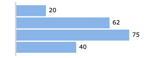
The snippet below shows option overrides for the Bar Sparkline:
sparklineOptions: {
    type: 'bar',
    direction: 'horizontal',
    fill: '#5470c6',
    stroke: '#91cc75',
    highlight: {
        highlightedItem: {
            fill: '#fac858'
        }
    },
    min: 0,
    max: 1
},
In the snippet above, the min and max properties are optional.
min and max properties are used to specify the interval within which the data values lie. These boundaries are used to create a scale which will be used to map data values from 0px to the size of the sparkline.
If the min and max properties are omitted, the domain will be set to the minimum and maximum values in the provided data, hence it could be different for different sparklines in the grid depending on the provided data.
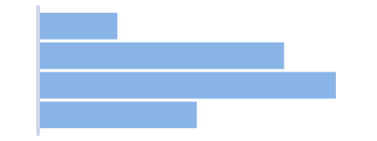
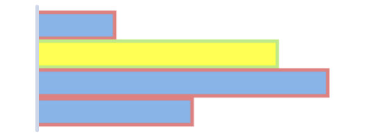
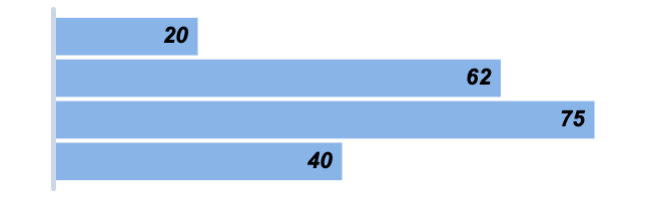
The following example demonstrates the results of the Bar Sparkline options above:
Note that min and max properties have been set to 0 and 1 respectively, indicating that the supplied data across all sparklines will contain values from 0 to 1. This allows easy comparisons across the different sparklines in the grid column as all sparklines will have the same domain.
Bar Fill Options Copy Link
To apply a custom color to the bars, set the fill property in sparklineOptions as shown:
sparklineOptions: {
    type: 'bar',
    direction: 'horizontal',
    fill: '#91cc75', // sets the bar fill
}
Default
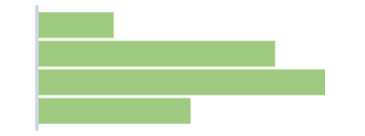
Custom fill
It is possible to set the fill for the highlighted state of the bar by adding fill in highlight options as follows:
sparklineOptions: {
    type: 'bar',
    direction: 'horizontal',
    highlight: {
        highlightedItem: {
            fill: 'orange', // sets the highlighted bar fill
        }
    }
}
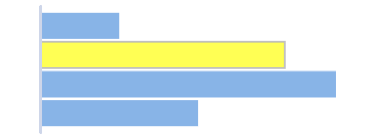
Default highlighted fill
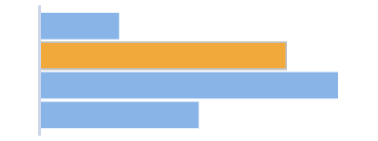
Custom highlighted fill
The given fill string can be in one of the following formats:
#rgb- Short Hex Code#rrggbb- Hex Codergb(r, g, b)- RGBrgba(r, g, b, a)- RGB with an alpha channel- CSS color keyword - such as
aqua,orange, etc.
Bar Stroke Options Copy Link
By default, the strokeWidth of each bar is 0, so no outline is visible around the bars.
To add a stroke, modify the strokeWidth and stroke properties as shown below.
sparklineOptions: {
    type: 'bar',
    direction: 'horizontal',
    stroke: '#ec7c7d', // sets the bar stroke
    strokeWidth: 2, // sets the bar stroke width
    highlight: {
        highlightedItem: {
            stroke: '#b5ec7c', // sets the highlighted bar stroke
            strokeWidth: 2, // sets the highlighted bar stroke width
        }
    }
}
- In the snippet above, we have configured the bar stroke to be
2px in the un-highlighted state, and2px in the highlighted state. - Note that the
strokeproperty is also different depending on the highlighted state of the bar.
Here is the result of the configuration shown in the above snippet.
Default

Custom stroke
Custom highlighted stroke
If strokeWidth is set to a value greater than 1, it is recommended to set the axis line strokeWidth to the same value in order to preserve the alignment of the bars with the axis line.
See AG Charts Series Markers for more information on marker options. See AG Charts Stylers for more information on item stylers.
Bar Padding Options Copy Link
The spacing between bars is adjustable via the paddingInner property. This property takes values between 0 and 1 and is available for axis type: 'category' only.
It is a proportion of the “step”, which is the interval between the start of a band and the start of the next band.
Here's an example.
sparklineOptions: {
    type: 'bar',
    direction: 'horizontal',
    axis: {
        type: 'category',
        paddingInner: 0.5, // sets the padding between bars.
    }
}
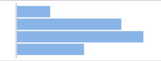
Default
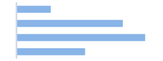
Custom paddingInner
The padding on the outer edges of the first and last bars can also be adjusted. As with paddingInner, this value can be between 0 and 1 and is available for axis type: 'category' only.
If the value of paddingOuter is increased, the axis line will stick out more at both ends of the sparkline.
Here's a snippet where the paddingOuter is set to 0.
sparklineOptions: {
    type: 'bar',
    direction: 'horizontal',
    axis: {
        type: 'category',
        paddingOuter: 0, // sets the padding on the outer edge of the first and last bars.
    }
}
In this case there will be no gap on either end of the sparkline, i.e. between the axis line start and the first bar and the axis line end and the last bar. This is demonstrated below in the middle sparkline.
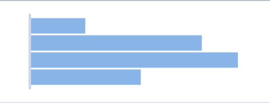
Default

No paddingOuter
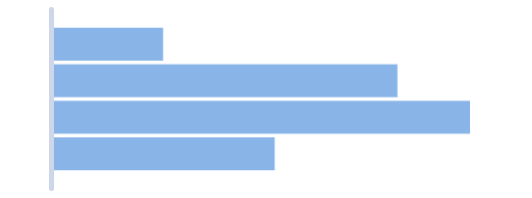
Increased paddingOuter
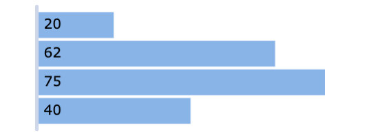
Bar Label Options Copy Link
To enable bar labels, set the enabled property in label options as shown:
sparklineOptions: {
    type: 'bar',
    direction: 'horizontal',
    label: {
        enabled: true // show bar labels
    }
}
Default

Label enabled
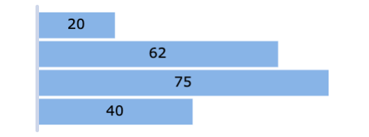
It is possible to change the text value displayed as the label of individual bars by adding a formatter callback function to label options as follows:
sparklineOptions: {
    type: 'bar',
    direction: 'horizontal',
    label: {
        enabled: true,
        formatter: labelFormatter
    }
}

function labelFormatter({ value }) {
    return `${value}%`
}
Default
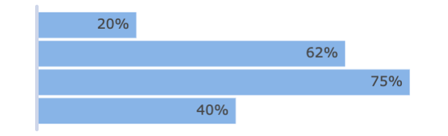
Custom label text
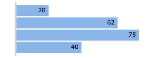
To customise the label text style, set the style attributes in label options as follows:
sparklineOptions: {
    type: 'bar',
    direction: 'horizontal',
    label: {
        enabled: true,
        fontWeight: 'bold',
        fontStyle: 'italic',
        fontSize: 9,
        fontFamily: 'Arial, Helvetica, sans-serif',
        color: 'black',
    }
}
Default
Custom label text styles
The position of the labels can be specified by setting the placement property in label options. By default, the labels are positioned at the end of the bars on the inside, i.e. placement is set to insideEnd . The snippet below shows how the positioning of the label can be modified:
sparklineOptions: {
    type: 'bar',
    direction: 'horizontal',
    label: {
        enabled: true,
        placement: 'inside-center', // positions the labels in the center of the bars
    }
}
Label placement options include inside-center, inside-start, inside-end, outside-start or outside-end from the AG Charts Label Placement documentation. These are shown in the screenshots below.
inside-start
inside-center
inside-end
outside-end
When configuring labels with placement: outside-end or outside-start, it is recommended to add some padding to the sparkline using the padding options in order to prevent the labels from being clipped.
Axis Line Options Copy Link
By default, an axis line is displayed which can be modified using the axis options.
Here is a snippet to demonstrate axis formatting.
sparklineOptions: {
    type: 'bar',
    direction: 'horizontal',
    axis: {
        stroke: '#7cecb3', // sets the axis line stroke
        strokeWidth: 3, // sets the axis line strokeWidth
    },
}
Default axis line

Custom axis line
It's possible to remove the axis line entirely by setting the axis strokeWidth to 0.
Sparkline Padding Options Copy Link
To add extra space around the sparklines, custom padding options can be applied in the following way.
sparklineOptions: {
    type: 'bar',
    direction: 'horizontal',
    // sets the padding around the sparklines
    padding: {
        top: 10,
        right: 5,
        bottom: 10,
        left: 5
    },
}
- The
top,right,bottomandleftproperties are all optional and can be modified independently.
Default padding
Custom padding
Building Progress Bars Copy Link
A progress bar can be used to visualise and compare values across multiple sparklines in the grid. It can illustrate values which have a fixed domain such as percentages and scores.
The following example shows how to build progress bars using bar sparklines. Note that:
- In order to display a progress bar in a sparkline, the data array should only contain a single value, more values in the data array will produce additional bars in the same sparkline.
minandmaxproperties have been set to0and100, indicating that the supplied data across all sparklines will contain values from0to100.- This allows easy comparisons of percentages across the different sparklines in the grid column as all sparklines will have the same domain.
- The
itemStylercallback function is used to dynamically set the fill color of each progress bar to different color values based on the datayValue. - Percentage Y values are displayed on the inside end of each bar by configuring
labeloptions. - The axis line and padding are removed to allow more space in each cell for the progress bar.
Additional Customisations Copy Link
More advanced customisations are discussed separately in the following sections:
- Axis - configure the axis type via
axisoptions. - Tooltips - configure tooltips using
tooltipoptions. - Points of Interest - configure individual points of interest using an
itemStyler.