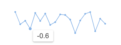
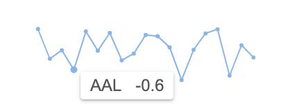
Tooltips containing data related to specific points will appear when the sparkline is hovered. Sparkline tooltips are customisable as discussed below.
The following sections cover how sparkline tooltips can be customised:
- Disabling Tooltips - shows how to disable tooltips.
- Tooltip Data - covers how to change title and content of the default tooltip and access data from other columns in the same row.
- Tooltip Styles available to customise the default tooltip styles.
- Custom Tooltip - demonstrates how a completely custom HTML template can be used as the tooltip.
Disabling Sparkline Tooltips Copy Link
Sparkline tooltips are enabled by default. They can be disabled via the tooltip options as shown in the code snippet below:
sparklineOptions: {
    tooltip: {
        enabled: false, // removes sparkline tooltips
    }
}
Default Tooltip Copy Link
The default sparkline tooltip has the following template:
    <div class="ag-charts-tooltip">
        <span class="ag-charts-tooltip-title"></span>
        <span class="ag-charts-tooltip-content"></span>
    </div>
The tooltip will show the Y value of the hovered item in the Content section of the tooltip, and the X value (if it exists) is displayed in the Title section of the tooltip. Both of these sections are inline <span> elements.
See the screenshots below for illustrations of these two cases.

No Title

With Title
Tooltip Data Copy Link
Tooltip Renderer Copy Link
The tooltips can be customised using a tooltip renderer function supplied to the tooltip options as shown below:
sparklineOptions: {
    tooltip: {
        renderer: tooltipRenderer // Add tooltip renderer callback function to customise tooltip styles and content
    }
}
- The
rendereris a callback function which receives data values associated with the highlighted data point. - It returns an object with the
contentandtitleproperties containing plain text that is used for the Content and Title sections of the tooltip. - Alternatively, the
rendererfunction could return a string representing HTML content, which can be used to provide completely Custom Tooltips.
Here's an example renderer function.
const tooltipRenderer = (params) => {
    const { yValue, xValue } = params;
    return {
        title: new Date(xValue).toLocaleDateString(), // formats date X values
        content: yValue.toFixed(1), // format Y number values
    }
}
The following example demonstrates the results of the tooltip renderer above. Note that:
- The renderer function sets the tooltip
contentto render Y values formatted with 1 digit after the decimal point. - The title of the tooltips is set to X values provided in the
paramsformatted using thetoLocaleString()method. This is optional because if X values are provided in the data, they will be formatted and displayed in the tooltip title by default.
Accessing Row Data Copy Link
It is possible to display data from other columns of the current row in the sparkline tooltip. This access is provided by the input parameter supplied to the Tooltip Renderer, which includes a context object with a data property containing the row data.
The following snippet shows how values from the Symbol column can be shown in the tooltip title:
const tooltipRenderer = (params) => {
    const { context } = params;
    return {
        title: context.data.symbol, // sets title of tooltips to the value for the 'symbol' field
    }
}
The following example demonstrates the above tooltip renderer.
Using CSS Styles Copy Link
More styling can be applied using the CSS class selector to select the tooltip HTML elements with the following class attributes: ag-charts-tooltip, ag-charts-tooltip-title, ag-charts-tooltip-content, and modifying the style definitions in a style sheet file.
This is shown in the example below. Note that:
- The default tooltip template is used and the style definitions are overriden in the styles.css file.
Custom Tooltip Copy Link
Instead of having the Tooltip Renderer return an object with title and content strings to be used in the default tooltip template, you can return a string with completely custom markup that will override the template.
We could use the following tooltip renderer to return custom HTML for the sparkline tooltip:
const tooltipRenderer = (params) => {
  const { yValue, context } = params;
  return `<div class='my-custom-tooltip my-custom-tooltip-arrow'>
              <div class='tooltip-title'>${context.data.symbol}</div>
              <div class='tooltip-content'>
                <div>Change: ${yValue}</div>
                <div>Volume: ${context.data.volume}</div>
              </div>
          </div>`;
}
The tooltip renderer function receives the params object as a single parameter. The xValue and yValue for the highlighted data point as well as the reference to the raw datum element from the sparkline data array is provided in the params object.
Other row data is provided in the context.data object inside the params object. You can process the raw values in the params object however you like before using them as a part of the returned HTML string.
The effect of applying the tooltip renderer from the snippet above can be seen in the example below.
Note that:
- The structure of the returned DOM is up to you.
- In this example the value of the title comes from
params.context.data.symbolwhich is the value for the Symbol column for the given row. - The elements have custom CSS class attributes, but the default class names can also be used so that the tooltip gets the default styling.
- The styles for the elements are defined in the external styles.css file.