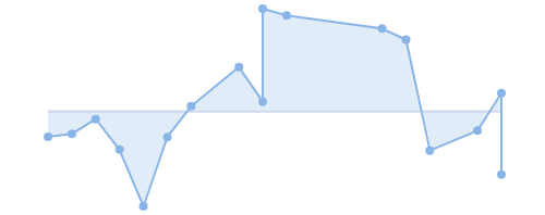
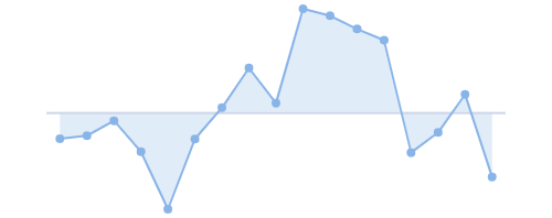
This section compares the different axis types that are available to all sparklines.
In order to select an appropriate sparkline axis type, it is important to consider the data the sparkline is displaying. This ensures that X values are scaled correctly along the axis.
The following axis types are available to all sparklines:
- Category Axis - data points are evenly spread along the axis.
- Number Axis - data is spaced based on the magnitude of the X values.
- Time Axis - data is spaced according to the time between data points.
The Y values supplied in the sparkline data will always be plotted using the Number Axis on a continuous scale.
Here's an illustration showing how sparklines can look visually different when different axis types are configured.

Time Axis

Category Axis
- Note that the same data is used for both sparklines.
- On the left, X values are plotted using a Time Axis, whereas on the right, X values are plotted using a Category Axis.
Category Axis Copy Link
The Category Axis is the default axis. X values will be plotted on a band scale which means the data points will be evenly spaced out along the axis making it ideal for small datasets with discrete values or categories.
The Category Axis is configured through the Chart Category Axis Options as follows:
<ag-grid-angular
    [columnDefs]="columnDefs"
    /* other grid options ... */ />

this.columnDefs = [
    {
        field: 'rateOfChange',
        cellRenderer: 'agSparklineCellRenderer',
        cellRendererParams: {
            sparklineOptions: {
                axis: {
                    // use Category Axis (Optional)
                    type: 'category'
                }
            }
        },
    },
    // other column definitions ...
];
In the snippet above, the axis type is set to 'category' but this is optional as the axis uses the 'category' axis by default.
The example below demonstrates the Category Axis used in an Area Sparkline. Note the following:
- The Rate Of Change column is mapped to data containing an Array of Tuples of type
[string, number][]. - The
stringX values are evenly spaced across the axis using a fixed width between each data point. - The
stringX values are included in the tooltip.
Number Axis Copy Link
The Number Axis is used as a value axis. When the Number Axis is used, the distance between the data points depends on the magnitude of the X values. X values must be number values as they are plotted on a continuous scale with numeric intervals.
The Number Axis is configured through the Chart Number Axis Options as follows:
<ag-grid-angular
    [columnDefs]="columnDefs"
    /* other grid options ... */ />

this.columnDefs = [
    {
        field: 'history',
        cellRenderer: 'agSparklineCellRenderer',
        cellRendererParams: {
            sparklineOptions: {
                axis: {
                    // use Number Axis
                    type: 'number'
                }
            }
        },
    },
    // other column definitions ...
];
In the snippet above, the axis type is set to 'number' to select a Number Axis instead of the default Category Axis.
The example below demonstrates the Number Axis used in an Area Sparkline. Note the following:
- The Rate Of Change column is mapped to data containing an Array of Tuples of type
[number, number][]. - The numeric X values are placed and spread along the axis based on the magnitude of the value.
- The numeric X values are included in the tooltip.
Time Axis Copy Link
The Time Axis is similar to the Number Axis in that it is also used to plot continuous values. X values can be number or Date objects, where number values are interpreted as timestamps derived from Unix time.
The Time Axis is configured through the Chart Time Axis Options as follows:
<ag-grid-angular
    [columnDefs]="columnDefs"
    /* other grid options ... */ />

this.columnDefs = [
    {
        field: 'rateOfChange',
        cellRenderer: 'agSparklineCellRenderer',
        cellRendererParams: {
            sparklineOptions: {
                axis: {
                    // use Time Axis
                    type: 'time'
                }
            }
        },
    },
    // other column definitions ...
];
In the snippet above, the axis type is set to 'time' to select a Time Axis instead of the default Category Axis.
The example below demonstrates the Time Axis used in an Area Sparkline. Note the following:
- The Rate Of Change column is mapped to data containing an Array of Tuples of type
[Date, number][]. - The
DateX values are placed in chronological order and spread along the axis based on the time between data points. - The
DateX values are included in the tooltip.