Text Filters allow you to filter string data.
Enabling Text Filters Copy Link
The Text Filter is the default filter used in AG Grid Community, but it can also be explicitly configured as shown below:
<ag-grid-angular
    [columnDefs]="columnDefs"
    /* other grid options ... */ />

this.columnDefs = [
    {
        field: 'athlete',
        // Text Filter is used by default in Community version
        filter: true,
        filterParams: {
            // pass in additional parameters to the Text Filter
        },
    },
    {
        field: 'country',
        // explicitly configure column to use the Text Filter
        filter: 'agTextColumnFilter',
        filterParams: {
            // pass in additional parameters to the Text Filter
        },
    },
];
Text Filter Parameters Copy Link
Text Filters are configured though the filterParams attribute of the column definition (ITextFilterParams interface):
Specifies the buttons to be shown in the filter, in the order they should be displayed in. The options are: 'apply': If the Apply button is present, the filter is only applied after the user hits the Apply button. 'clear': The Clear button will clear the (form) details of the filter without removing any active filters on the column. 'reset': The Reset button will clear the details of the filter and any active filters on that column. 'cancel': The Cancel button will discard any changes that have been made to the filter in the UI, restoring the applied model. |
By default, text filtering is case-insensitive. Set this to true to make text filtering case-sensitive. |
If the Apply button is present, the filter popup will be closed immediately when the Apply or Reset button is clicked if this is set to true. |
Overrides the default debounce time in milliseconds for the filter. Defaults are: TextFilter and NumberFilter: 500ms. (These filters have text field inputs, so a short delay before the input is formatted and the filtering applied is usually appropriate). DateFilter and SetFilter: 0ms |
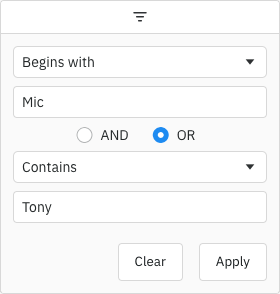
By default, the two conditions are combined using AND. You can change this default by setting this property. Options: AND, OR
|
The default filter option to be selected. |
Array of filter options to present to the user.
|
Placeholder text for the filter textbox.
|
Maximum number of conditions allowed in the filter. |
By default only one condition is shown, and additional conditions are made visible when the previous conditions are entered (up to maxNumConditions). To have more conditions shown by default, set this to the number required. Conditions will be disabled until the previous conditions have been entered. Note that this cannot be greater than maxNumConditions - anything larger will be ignored. |
If set to true, disables controls in the filter to mutate its state. Normally this would be used in conjunction with the Filter API. |
Formats the text before applying the filter compare logic. Useful if you want to substitute accented characters, for example.
|
Used to override how to filter based on the user input. Returns true if the value passes the filter, otherwise false.
|
If true, the input that the user enters will be trimmed when the filter is applied, so any leading or trailing whitespace will be removed. If only whitespace is entered, it will be left as-is. If you enable trimInput, it is best to also increase the debounceMs to give users more time to enter text. |
The following example demonstrates configuring different Text Filter parameters:
- For the Athlete column:
- The filter has a debounce of 200ms (
debounceMs = 200). - Only one Filter Condition is allowed (
maxNumConditions = 1)
- The filter has a debounce of 200ms (
- For the Country column:
- The filter input will be trimmed when the filter is applied (
trimInput = true) - There is a debounce of 1000ms (
debounceMs = 1000)
- The filter input will be trimmed when the filter is applied (
- For the Sport column:
- The filter is case-sensitive (
caseSensitive = true)
- The filter is case-sensitive (
Text Formatter Copy Link
By default, the grid compares the Text Filter with the values in a case-insensitive way, by converting both the filter text and the values to lower case and comparing them; for example, 'o' will match 'Olivia' and 'Salmon'. If you instead want to have case-sensitive matches, you can set caseSensitive = true in the filterParams, so that no lowercasing is performed. In this case, 'o' would no longer match 'Olivia'.
You might have more advanced requirements, for example to ignore accented characters. In this case, you can provide your own textFormatter, which is a function with the following signature:
Formats the text before applying the filter compare logic. Useful if you want to substitute accented characters, for example.
|
from is the value coming from the grid. This can be from the valueGetter if there is any for the column, or the value as originally provided in the rowData. The function should return a string to be used for the purpose of filtering.
The Text Formatter is applied to both the filter text and the values before they are compared.
The following is an example function to remove accents and convert to lower case.
const toLowerWithoutAccents = value => value == null
    ? null
    : value.toLowerCase()
        .replace(/[àáâãäå]/g, 'a')
        .replace(/æ/g, 'ae')
        .replace(/ç/g, 'c')
        .replace(/[èéêë]/g, 'e')
        .replace(/[ìíîï]/g, 'i')
        .replace(/ñ/g, 'n')
        .replace(/[òóôõö]/g, 'o')
        .replace(/œ/g, 'oe')
        .replace(/[ùúûü]/g, 'u')
        .replace(/[ýÿ]/g, 'y');
Note that when providing a Text Formatter, the caseSensitive parameter is ignored. In this situation, if you want to do a case-insensitive comparison, you will need to perform case conversion inside the textFormatter function.
The example below demonstrates a textFormatter on the Athlete column:
- If you search for
'o'it will find'ö'. You can try this by searching the string'Bjo'.
Text Custom Matcher Copy Link
In most cases, you can customise the Text Filter matching logic by providing your own Text Formatter, e.g. to remove or replace characters in the filter text and values. The Text Formatter is applied to both the filter text and values before the filter comparison is performed.
For more advanced use cases, you can provide your own textMatcher to decide when to include a row in the filtered results. For example, you might want to apply different logic for the filter option equals than for contains.
Used to override how to filter based on the user input. Returns true if the value passes the filter, otherwise false.
|
The following is an example of a textMatcher that mimics the current implementation of AG Grid. This can be used as a template to create your own.
<ag-grid-angular
    [columnDefs]="columnDefs"
    /* other grid options ... */ />

this.columnDefs = [
    {
        field: 'athlete',
        filter: 'agTextColumnFilter',
        filterParams: {
            textMatcher: ({ filterOption, value, filterText }) => {
                if (filterText == null) {
                    return false;
                }
                switch (filterOption) {
                    case 'contains':
                        return value.indexOf(filterText) >= 0;
                    case 'notContains':
                        return value.indexOf(filterText) < 0;
                    case 'equals':
                        return value === filterText;
                    case 'notEqual':
                        return value != filterText;
                    case 'startsWith':
                        return value.indexOf(filterText) === 0;
                    case 'endsWith':
                        const index = value.lastIndexOf(filterText);
                        return index >= 0 && index === (value.length - filterText.length);
                    default:
                        // should never happen
                        console.warn('invalid filter type ' + filterOption);
                        return false;
                }
            }
        }
    }
];
Note that the textMatcher is not called for the blank and notBlank options.
The example below demonstrates a textMatcher on the Country column:
- Most options are implemented as per the default grid implementation above.
- The
containsoption has additional logic so that aliases can be entered in the filter. E.g. if you filter using the text'usa'it will matchUnited States, or'holland'will match'Netherlands'.
Text Filter Model Copy Link
The Filter Model describes the current state of the applied Text Filter. If only one Filter Condition is set, this will be a TextFilterModel:
Filter type is always 'text' |
The text value associated with the filter. It's optional as custom filters may not have a text value.
|
The 2nd text value associated with the filter, if supported.
|
One of the filter options, e.g. 'equals' |
If more than one Filter Condition is set, then multiple instances of the model are created and wrapped inside a Combined Model (ICombinedSimpleModel<TextFilterModel>). A Combined Model looks as follows:
// A filter combining multiple conditions
interface ICombinedSimpleModel<TextFilterModel> {
    filterType: string;

    operator: JoinOperator;

    // multiple instances of the Filter Model
    conditions: TextFilterModel[];
}

type JoinOperator = 'AND' | 'OR';
An example of a Filter Model with two conditions is as follows:
// Text Filter with two conditions, both are equals type
const textEqualsSwimmingOrEqualsGymnastics = {
    filterType: 'text',
    operator: 'OR',
    conditions: [
        {
            filterType: 'text',
            type: 'equals',
            filter: 'Swimming'
        },
        {
            filterType: 'text',
            type: 'equals',
            filter: 'Gymnastics'
        }
    ]
};
Text Filter Options Copy Link
The Text Filter presents a list of Filter Options to the user.
The list of options is as follows:
| Option Name | Option Key | Included by Default |
|---|---|---|
| Contains | contains | Yes |
| Does not contain | notContains | Yes |
| Equals | equals | Yes |
| Does not equal | notEqual | Yes |
| Begins with | startsWith | Yes |
| Ends with | endsWith | Yes |
| Blank | blank | Yes |
| Not blank | notBlank | Yes |
| Choose one | empty | No |
Note that the empty filter option is primarily used when creating Custom Filter Options. When 'Choose one' is displayed, the filter is not active.
The default option for the Text Filter is contains.
When providing filter options, the default filter option (or the first option if no default set) must be an option that displays an input or the empty filter option (as a filter option with no inputs would mean the filter is active by default).
The example below demonstrates configuring different filter options:
- For the Athlete column, there are only two filter options:
filterOptions = ['contains', 'notContains']. - For the Country column, there is only one filter option:
filterOptions = ['contains']. - For the Sport column, there is a different default filter option:
defaultOption = 'startsWith'.
Text Filter Values Copy Link
By default, the values supplied to the Text Filter are retrieved from the data based on the field attribute. This can be overridden by providing a filterValueGetter in the Column Definition. This is similar to using a Value Getter, but is specific to the filter.
Function or expression. Gets the value for filtering purposes. |
Applying the Text Filter Copy Link
Applying the Text Filter is described in more detail in the following sections:
Data Updates Copy Link
The Text Filter is not affected by data changes. When the grid data is updated, the filter value will remain unchanged and the filter will be re-applied based on the updated data (e.g. the displayed rows will update if necessary).